

Packaging design used to be something only bigger brands really invested in, but between direct-to-consumer shipping, farmers markets, and the sheer amount of product photography happening on social media now, small brands are under more pressure than ever to have packaging that actually holds its own. Here’s what I’m seeing move the needle right now, based on both client work and just genuinely paying attention to what’s out there.
What’s working:
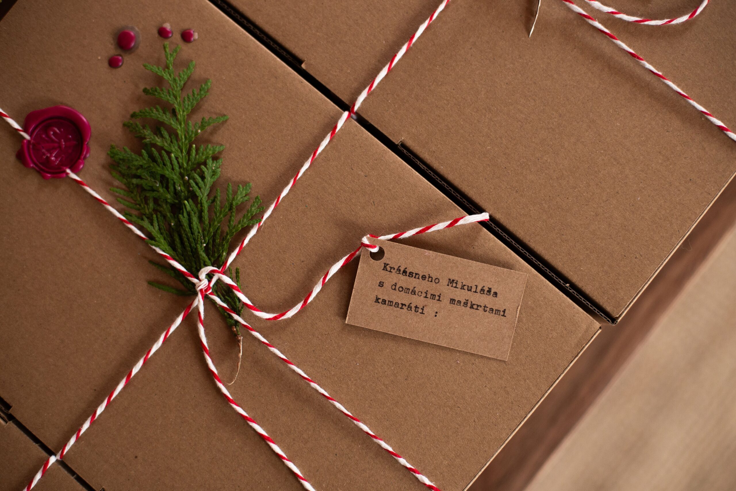
- Tactile, unexpected materials. Kraft paper, unusual paper stocks with visible texture, ribbon or twine instead of plastic tape — small touches that make unboxing feel considered rather than purely functional. This matters even more now that unboxing is often its own little photo or video moment people share.
- Restrained color palettes with one strong accent, rather than trying to cram the whole brand palette onto one small label. Packaging real estate is limited — a focused palette reads as more premium than a busy one.
- Honest, specific ingredient or material storytelling right on the package, not buried in a website footnote. Where something was sourced, who made it, what’s actually in it — small brands have a real authenticity advantage here over bigger competitors, and good packaging design leans into that instead of hiding it.
- Refillable and reusable packaging formats, driven partly by genuine sustainability interest and partly by the fact that a beautiful reusable container gets kept around and reused as free, ongoing advertising, long after the product inside is gone.
- Playful, illustrated detail work on labels and boxes — a small hand-drawn flourish, a pattern that wraps around the whole container, something that rewards a second, closer look instead of being purely functional.
What I’d steer clients away from:
- Overcomplicated packaging that prioritizes cleverness over function. A beautiful box that’s genuinely difficult to open, or a label so minimal it’s hard to actually find the product information people need, is a design failure no matter how good it photographs.
- Packaging that doesn’t photograph well, in an era where a huge amount of a small brand’s marketing is going to be other people’s phone photos of your product. If it looks flat or unclear in a quick, casual photo, that’s a real, practical problem worth designing around.
- Trend-chasing packaging that ignores actual shelf or shipping practicality. A gorgeous design that doesn’t survive shipping, or doesn’t stand out enough at actual shelf distance in a real store, isn’t doing its job, no matter how well it photographs sitting alone on a clean desk.
The businesses getting the most out of their packaging right now are treating it as a genuine extension of their brand system — same colors, same type, same personality as everything else — rather than a separate design problem solved in isolation at the last minute before a product launch. If you’ve built out a solid brand system already, good packaging is often more about translating what already exists than starting from scratch, which makes it a lot more manageable than it might sound.
A small but genuinely useful habit if you’re designing your own packaging, or reviewing a designer’s proposed direction: mock it up in a real, physical context before committing to a full print run. Print even a rough version at home, wrap it around an actual product, and photograph it the way a customer actually would — on a phone, in normal lighting, maybe held in a hand. Packaging that looks gorgeous as a flat digital rendering sometimes falls apart the second it’s photographed in a real, slightly imperfect, real-world setting, and it’s a lot cheaper to catch that at the mockup stage than after five hundred units have already been printed.
I’d also gently flag: packaging is one of the areas where it’s genuinely worth spending a little more than the bare minimum, if your budget allows it, because the material itself is part of the message. A flimsy box or a cheap-feeling label undercuts even a beautifully designed graphic sitting on top of it — customers register the physical weight and texture of packaging almost instantly, often before they’ve consciously registered anything about the actual design. Sometimes the highest-impact design decision isn’t a design decision at all. It’s choosing a slightly better cardstock.