

Every January (okay, this year I’m a little late to the party) design blogs put out their trend predictions, and every year about half of them are just “bold colors” and “authenticity” dressed up in new language. So let’s skip the vague stuff and get into what I’m genuinely seeing show up in client requests and what I’m quietly steering people away from.
What I’m into right now:
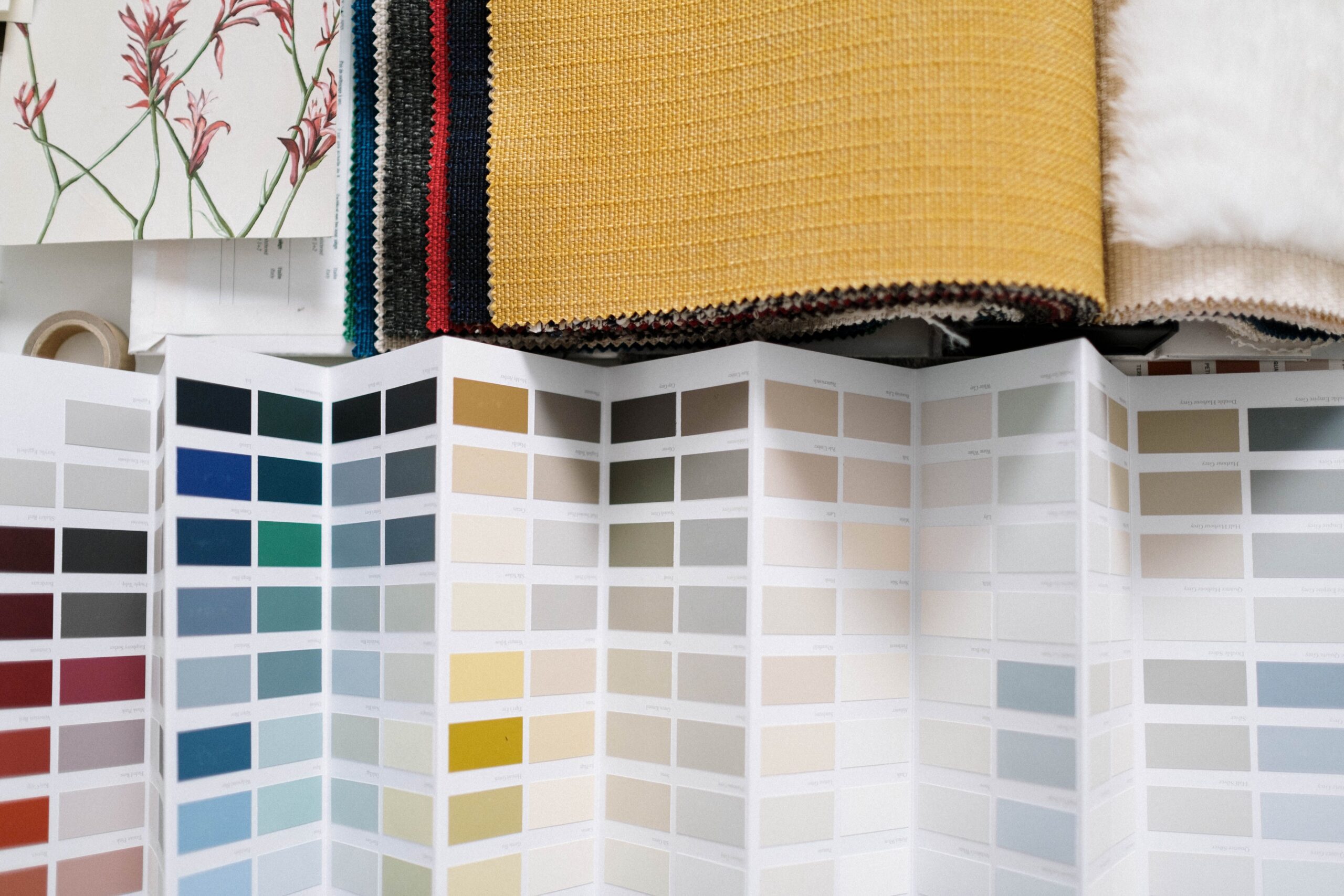
- Warm, grounded palettes over cold minimalism. Clients are asking for browns, terracottas, warm creams, and forest greens instead of the stark black-and-white-and-one-accent-color look that dominated the last few years. It reads as more human, less “we are a Silicon Valley app.”
- Hand-drawn and imperfect details. Little illustrated flourishes, slightly wobbly line work, textures that look like actual ink or actual paper. After a decade of everything being perfectly vectorized and geometric, a little imperfection feels like a relief.
- Type doing more of the heavy lifting. Big, expressive, characterful fonts as the main visual event, with the rest of the design staying quiet around them. Good typography has always mattered, but it’s having a real moment as the star of the show instead of the supporting act.
- Nostalgia, but specific nostalgia. Not generic “retro,” but a very particular decade or reference point — late-90s software interfaces, mid-century travel posters, that one specific era of hand-lettered grocery store signage. Vague nostalgia is boring. Specific nostalgia has personality.
What I’d like to see take a nap for a while:
- Overly generic “friendly” branding. You know the one — rounded blob logo, pastel palette, cheerful sans-serif, could belong to a meditation app, a bank, or a dog walking service with zero changes needed. It’s not bad, it’s just so common it’s starting to say nothing.
- AI-generated stock imagery that looks almost right. The uncanny hands, the text that’s almost words, the lighting that doesn’t quite make sense. I use AI tools plenty in my own workflow (we’ll get into that on the automations side of this blog), but as finished client-facing imagery, it’s not there yet, and people can usually feel that something’s off even if they can’t say what.
- Trend-chasing for its own sake. The businesses that come to me wanting to look exactly like whatever’s popular on Pinterest this month are the ones most likely to need a full rebrand again in eighteen months. Trends are useful as seasoning, not as the whole meal.
If there’s a thread running through what I like versus what I’m tired of, it’s this: the good stuff feels specific to a real business with a real point of view. The stuff I’m over feels like it could belong to anyone. That’s the test I run every trend through before I bring it into a client project — not “is this popular,” but “does this actually belong to you.”
A question that comes up a lot when I share lists like this: “okay, but how do I know if a trend is actually right for my brand, versus just currently popular?” Here’s the filter I actually use, walking a client through it:
- Does it fit the personality you already have, or the one you’re actively trying to build? A trend that contradicts your existing brand voice will always feel like a costume, no matter how well-executed.
- Will it still feel intentional in three years, even if the specific trend has faded? Warm earth tones, for instance, aren’t likely to feel dated the way a very specific meme-adjacent aesthetic might, because they’re rooted in something more timeless than a single cultural moment.
- Are you drawn to it because it genuinely fits, or because a competitor just did it and you’re feeling behind? Those are two very different motivations, and only one of them tends to produce work you’ll still be happy with once the initial trend cycle moves on.
I’d also add: trends are more useful applied selectively than adopted wholesale. A brand doesn’t need to chase every item on a list like this one — pulling in a single relevant thread (say, warmer color choices) while ignoring the rest is usually a much stronger, more specific outcome than trying to check every box on a trend report at once. The businesses whose rebrands hold up longest are almost always the ones that treated trends as seasoning on top of something already solid, not as the entire recipe.