On the enormously long list of things you need to accomplish to start a business whilst remaining legal, budget-conscious and successful, does hiring a great designer to create a logo land nearer the top or bottom? Creative projects often get cut first when the budget is tight. Just look at what gets cut first from our education programs in schools. The question is –
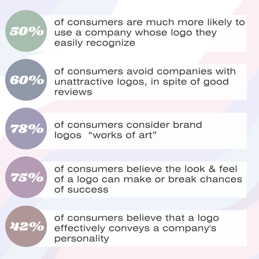
Ask a designer where it should fall on the priority list and they’re going to tell you to push it to the top, but should you or are they just here to make a sale? As a designer, I say both are true. We’re definitely interested in making a living just like you, but we also know the value of a great logo. Here are a few stats that show the actual impact a logo has on the average consumer (Studyfinds.org survey, 2020):
So, what makes a good logo? Here’s a short list:
- Feeling/theme
- Font choices
- Looks good at any scale
- Unique
- Conveys intended message
- Simple
- Versatile
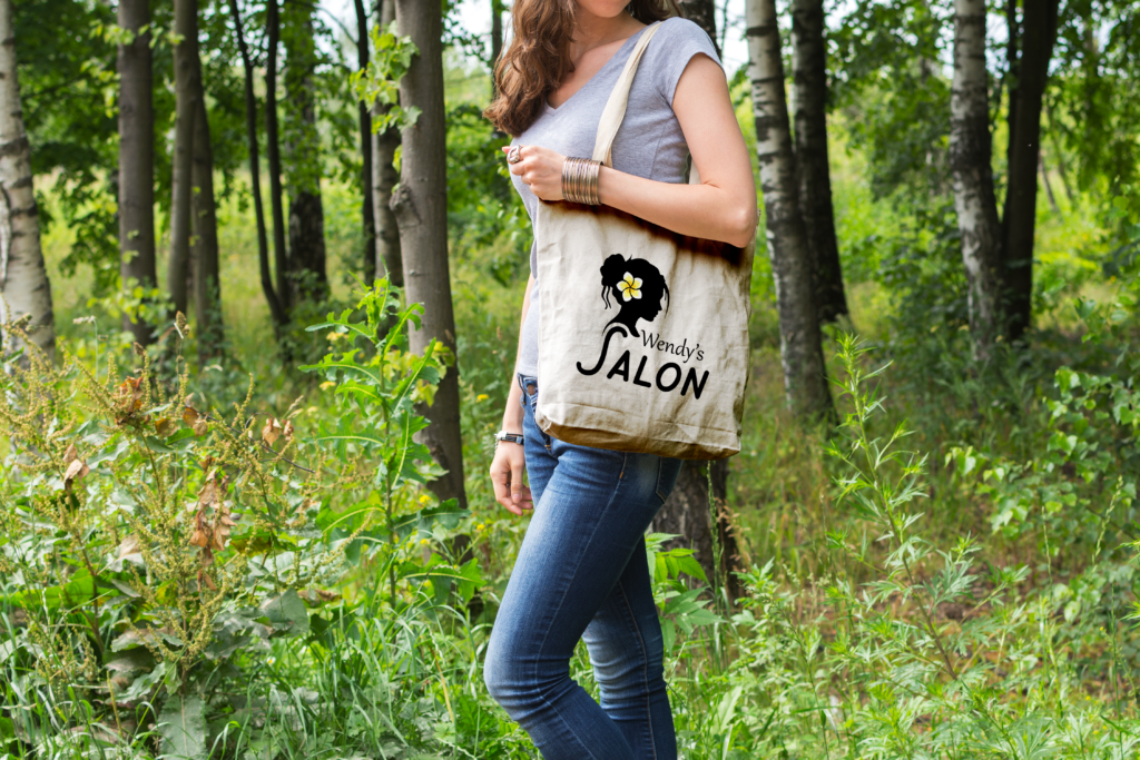
Let’s take a look at a logo I designed for a small business called Wendy’s Salon.
Does it tick all the boxes on the list? The client wanted the following concepts incorporated in their logo:
- Feminine, delicate
- California
- Hair
- Boho, trendy, vintage
So, here’s my thought process for Wendy’s Salon:
In order to convey everything the client wanted, I started with a silhouette, which is reminiscent of a cameo (a vintage style of jewelry with a profiled head carved in relief) wearing a Boho/California hairstyle. The plumeria draws attention to the hair and is a flower commonly found in California.
The fonts in this design were chosen specifically to convey a feminine and relaxed feeling. The “S” in salon delicately hugs the curve at the bottom of the silhouette, which mimics the curve on a vintage cameo brooch. The combination of a modern, relaxed font (like the one used for the word “salon”) and the vintage feel of the silhouette gives the design a uniqueness.
The simplicity of the silhouette removes most of the busy details of the face while still remaining unmistakable. It’s further simplified in the choice to use a single spot of color. These details also allow the logo to be scaled down further than if there were lots of tiny details.
In order to be versatile, this design was presented to the client in a few different ways. The logo above is used for most applications such as the sign outside the building, uniforms, and marketing materials. As an icon only logo mark (the silhouette without text), it is used for applications where less space is available or where it will be scaled down to its very smallest (e.g. – a browser icon). See below.
If I had to say what I think the main takeaway is, I’d say that I don’t believe that a logo is meant to just make you look professional. If that was the case, we’d have a lot more people designing their own logos in MS Paint (maybe not, but maybe Canva?). The point is (and I think this is evident in the above statistics) that a great design makes your brain light up in ways that are a little bit magic. To create memories. To create connections. To create attraction. Your designer isn’t just in the business of creativity. They’re in the business of oxytocin and dopamine.